Maui Blazor Mobile Template

When you want to try out the .Net MAUI Blazor template, you will be able to run the standard Blazor test website on your mobile phone without any issues.

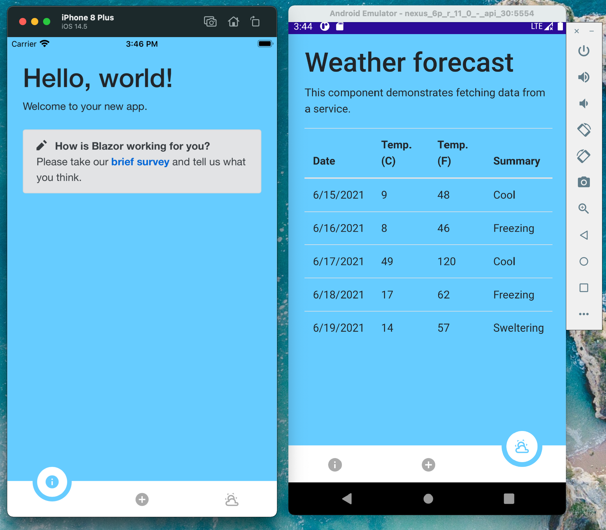
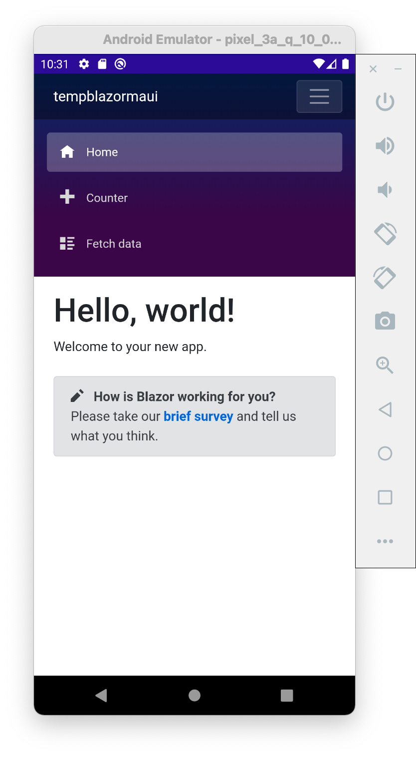
But let’s be honest, that template is not what we would expect from a mobile app. It is responsive so the sidebar changes into a menu, but it still feels like a real website instead of a mobile app. So let me show you an alternative version of how the default Blazor template could look like a mobile application.

Original template:
original maui blazor template

What we are going to design:

mobile maui blazor template

Most mobile apps would have a bottom tab bar that enables the user to select specific parts of the application. The Blazor test website has 3 such sections that we can identify. A general info page, a counter demo page and lastly a weather service data page.
So for our mobile version we are going to create 3 selectable items in the bottom tab bar.

To get this in our blazor environment, we are going to add 3 HTML input elements that we can style using CSS. Also each time the user selects one of the input elements, we trigger the correct Blazor navigation using the NavManager and as url the value of the input.
The bottom bar icon elements are rendered with use of SVG paths.

 1
 2
 3
 4
 5
 6
 7
 8
 9
10
11
12
13
14
15
16
17
18
19
20
21
22
23
24
25
26
27
28
29
30
31
32
33
34
35
36
37
38
39
40
41
42
@inject NavigationManager NavManager

<div class="content px-4">
	@Body
</div>

<div class="bottombarcontainer">
  <div class="bottombar">
    <input type="radio" name="tap" id="t0" checked="checked" @onchange="OnChange" value="">
    <label class="round" for="t0">
    <span class="icon">
		<svg xmlns="http://www.w3.org/2000/svg" width="24" height="24" viewBox="0 0 24 24">
			<path fill="currentColor" d="M13,9H11V7H13M13,17H11V11H13M12,2A10,10 0 0,0 2,12A10,10 0 0,0 12,22A10,10 0 0,0 22,12A10,10 0 0,0 12,2Z" />
		</svg>
    </span>
      </label>
    <input type="radio" name="tap" id="t1" @onchange="OnChange" value="counter">
    <label class="round" for="t1">
    <span class="icon">
		<svg xmlns="http://www.w3.org/2000/svg" width="24" height="24" viewBox="0 0 24 24">
			<path fill="currentColor" d="M17,13H13V17H11V13H7V11H11V7H13V11H17M12,2A10,10 0 0,0 2,12A10,10 0 0,0 12,22A10,10 0 0,0 22,12A10,10 0 0,0 12,2Z" />
		</svg>
    </span>
    </label>
    <input type="radio" name="tap" id="t2" @onchange="OnChange" value="fetchdata">
    <label class="round" for="t2">
    <span class="icon">
		<svg xmlns="http://www.w3.org/2000/svg" width="24" height="24" viewBox="0 0 24 24">
			<path fill="currentColor" d="M12.74,5.47C15.1,6.5 16.35,9.03 15.92,11.46C17.19,12.56 18,14.19 18,16V16.17C18.31,16.06 18.65,16 19,16A3,3 0 0,1 22,19A3,3 0 0,1 19,22H6A4,4 0 0,1 2,18A4,4 0 0,1 6,14H6.27C5,12.45 4.6,10.24 5.5,8.26C6.72,5.5 9.97,4.24 12.74,5.47M11.93,7.3C10.16,6.5 8.09,7.31 7.31,9.07C6.85,10.09 6.93,11.22 7.41,12.13C8.5,10.83 10.16,10 12,10C12.7,10 13.38,10.12 14,10.34C13.94,9.06 13.18,7.86 11.93,7.3M13.55,3.64C13,3.4 12.45,3.23 11.88,3.12L14.37,1.82L15.27,4.71C14.76,4.29 14.19,3.93 13.55,3.64M6.09,4.44C5.6,4.79 5.17,5.19 4.8,5.63L4.91,2.82L7.87,3.5C7.25,3.71 6.65,4.03 6.09,4.44M18,9.71C17.91,9.12 17.78,8.55 17.59,8L19.97,9.5L17.92,11.73C18.03,11.08 18.05,10.4 18,9.71M3.04,11.3C3.11,11.9 3.24,12.47 3.43,13L1.06,11.5L3.1,9.28C3,9.93 2.97,10.61 3.04,11.3M19,18H16V16A4,4 0 0,0 12,12A4,4 0 0,0 8,16H6A2,2 0 0,0 4,18A2,2 0 0,0 6,20H19A1,1 0 0,0 20,19A1,1 0 0,0 19,18Z" />
		</svg>
    </span>
    </label>
    <div class="div" id="back"></div>
  </div>
</div>

@code {
    private async void OnChange(ChangeEventArgs args)
    {
		  NavManager.NavigateTo($"/{args.Value.ToString()}");
    }
}

The corresponding CSS to enable the nice UI and animations can be seen below. The important thing to note are the special CSS changes for the checked value of the input/radio.

 1
 2
 3
 4
 5
 6
 7
 8
 9
10
11
12
13
14
15
16
17
18
19
20
21
22
23
24
25
26
27
28
29
30
31
32
33
34
35
36
37
38
39
40
41
42
43
44
45
46
47
48
49
      .bottombarcontainer .bottombar {
        display: flex;
        position: fixed;
        bottom: 0;
        background: white;
        width: 100%;
        height: 55px;
        bottom: 0;
        justify-content: space-around;
        align-items: center;
      }
      .bottombarcontainer .bottombar #back {
        width: 100%;
        position: absolute;
        background: white;
        height: 45px;
        bottom: 0;
        z-index: 0;
      }
      .bottombarcontainer .bottombar input[type="radio"]:checked + .round {
        transform: translate(0, -22px);
        background: white;
        border:7px solid #66ccff;
      }
      .bottombarcontainer .bottombar input[type="radio"]:checked + .round svg {
        color: #66ccff;
      }
      .bottombarcontainer .bottombar input {
        display: none;
      }
      .bottombarcontainer .bottombar .round {
        position: relative;
        width: 60px;
        height: 60px;
        /* background: white; */
        border-radius: 50%;
        transform: translate(0, 5px);
        transition: transform 0.3s ease;
        will-change: transform;
        cursor: pointer;
        z-index: 1;
        text-align: center;
        border:7px solid transparent;
      }
      .bottombarcontainer .bottombar .round svg {
        height: 100%;
        color: #aaa;
        line-height: 45px;
      }

With that set, we now have a more real mobile app experience for the default .Net Maui Blazor template. Of course this example changes the complete look and feel, you can mix both designs when using CSS media queries! You can see the nice animations in the end result:

alt text

All code for this example can be found on my GitHub page here https://github.com/Depechie/MauiBlazorMobileTemplate.