Not so long ago there was this little online event called Xamarin Expert Day that featured a bunch of awesome speakers.
Now one talk got my full attention, it was the one from Hussain Abbasi about Supercharge You Custom Controls With Control Templates ( re-watch it here… ).
When I developed apps uniquely for Windows with UWP, I used Control Templates often. But with Xamarin Forms I never took the time to get much into it… Hussain did a great job explaining the principals on how and why to use them and with that it spiked my interest again to try something out with Xamarin Forms.
The fact I did not yet used them often, is because the Visual State Manager in Xamarin Forms is still not up to par with the one we have in UWP. But since the VSM evolved a bit in Xamarin Forms, I thought the time was ripe to try something with it again.
So one example Hussain highlighted in his talk, was how you could show a different view of some data by swapping the style of a ContentView while using Control Templates. He did this in code while using Xamarin Essentials to detect landscape or portrait mode of your phone.
Let me show you another way of doing a similar thing, but this time all declared from markup XAML.
This is not 100% true, because this whole process will only work because we first need to create our own StateTrigger in code, that we can use with the VSM, but using it is done all from XAML.
The setup of our example is as follows. You have a certain data structure that you need to present to the user, but each data element is of a certain category. In our case we are using Animal types ( Cat, Dog, Bird ).
If we want to have a different view depending on the animal type, we can leverage control templates and swap the style of our ContentView based on our data. And because we are going to do it from XAML this should all be done through Data Binding.
Let’s start with the basics, how does our data look like.
1
2
3
4
5
6
|
public class AnimalModel
{
    public AnimalType Animal { get; set; }
    public string AnimalName { get; set; }
    public string AnimalDescription { get; set; }
}
|
It’s a simple class that could hold several data points, most important part for our demo is the AnimalType enum, this categorizes our data.
Currently it consists of 3 types.
1
2
3
4
5
6
|
public enum AnimalType
{
    Dog,
    Cat,
    Bird
}
|
Depending on this enum we would like to present the data differently, a control template is a fine choice for this. You can have some layout depending on what type of animal it is and still show your regular content inside of it.
For this to work, we need to create a ContentView that will act as host container for our Control Templates.
 1
 2
 3
 4
 5
 6
 7
 8
 9
10
11
12
13
14
15
16
17
18
19
20
21
22
23
24
25
26
27
28
29
30
31
32
33
34
35
36
37
38
|
<ContentView xmlns="http://xamarin.com/schemas/2014/forms"
             xmlns:x="http://schemas.microsoft.com/winfx/2009/xaml"
             xmlns:models="clr-namespace:VisualStateTriggers.Models"
             xmlns:triggers="clr-namespace:VisualStateTriggers.Triggers"
             x:Class="VisualStateTriggers.Controls.AnimalView"
             x:Name="AnimalViewName"
             Padding="0,0,0,5">
    <VisualStateManager.VisualStateGroups>
        <VisualStateGroupList>
            <VisualStateGroup>
                <VisualState x:Name="CatVisualState">
                    <VisualState.StateTriggers>
                        <triggers:EnumStateTrigger EnumType="{x:Type models:AnimalType}" EnumValue="{x:Static models:AnimalType.Cat}" Value="{Binding Animal}" />
                    </VisualState.StateTriggers>
                    <VisualState.Setters>
                        <Setter Property="Style" Value="{StaticResource CatTemplateStyle}" />
                    </VisualState.Setters>
                </VisualState>
                <VisualState x:Name="DogVisualState">
                    <VisualState.StateTriggers>
                        <triggers:EnumStateTrigger EnumType="{x:Type models:AnimalType}" EnumValue="{x:Static models:AnimalType.Dog}" Value="{Binding Animal}" />
                    </VisualState.StateTriggers>
                    <VisualState.Setters>
                        <Setter Property="Style" Value="{StaticResource DogTemplateStyle}" />
                    </VisualState.Setters>
                </VisualState>
                <VisualState x:Name="BirdVisualState">
                    <VisualState.StateTriggers>
                        <triggers:EnumStateTrigger EnumType="{x:Type models:AnimalType}" EnumValue="{x:Static models:AnimalType.Bird}" Value="{Binding Animal}" />
                    </VisualState.StateTriggers>
                    <VisualState.Setters>
                        <Setter Property="Style" Value="{StaticResource BirdTemplateStyle}" />
                    </VisualState.Setters>
                </VisualState>
            </VisualStateGroup>
        </VisualStateGroupList>
    </VisualStateManager.VisualStateGroups>
</ContentView>
|
There is a lot going on in this host container, so let’s break it down a bit.
First thing to notice here, is that we are only using XAML to handle the different views, we leverage the Visual State Manager for this. It will, depending on the AnimalType enum, select the correct Control Template and apply it as Style to the ContentView!
For the Visual State Manager to be able to know what Control Template to use, we use a Custom State Trigger, we will pass the enum type, 1 target enum value of that type and the actual enum value of the data item to the trigger.
Inside this Custom State Trigger we will validate these parameters and set the trigger active or not if the needed criteria matches. In this case, if the current data item enum value equals the target enum value given in XAML.
 1
 2
 3
 4
 5
 6
 7
 8
 9
10
11
12
13
14
15
16
17
18
19
20
21
22
23
24
25
26
27
28
29
30
31
32
33
34
35
36
37
38
39
40
|
public class EnumStateTrigger : StateTriggerBase
{
    public static readonly BindableProperty EnumTypeProperty = BindableProperty.Create(nameof(EnumType), typeof(Type), typeof(EnumStateTrigger), null);

    public static readonly BindableProperty EnumValueProperty = BindableProperty.Create(nameof(EnumValue), typeof(object), typeof(EnumStateTrigger), null, propertyChanged: OnBindablePropertyChanged);

    public static readonly BindableProperty ValueProperty = BindableProperty.Create(nameof(Value), typeof(object), typeof(EnumStateTrigger), null, propertyChanged: OnBindablePropertyChanged);

    public Type EnumType
    {
        get => (Type)GetValue(EnumTypeProperty);
        set => SetValue(EnumTypeProperty, value);
    }

    public object EnumValue
    {
        get => (object)GetValue(EnumValueProperty);
        set => SetValue(EnumValueProperty, value);
    }

    public object Value
    {
        get => (object)GetValue(ValueProperty);
        set => SetValue(ValueProperty, value);
    }

    private static void OnBindablePropertyChanged(BindableObject bindable, object oldValue, object newValue)
    {
        var trigger = bindable as EnumStateTrigger;
        trigger.UpdateTrigger();
    }

    private void UpdateTrigger()
    {
        if (EnumType is null || EnumValue is null || Value is null || !EnumType.IsEnum || !EnumType.IsEnumDefined(EnumValue) || !EnumType.IsEnumDefined(Value))
            SetActive(false);
        else
            SetActive(Enum.Equals(EnumValue, Value));
    }
}
|
Passing the actual enum type is not mandatory, but I wanted to show you how this could be done, so that you can also validate if the enum values are indeed contained in the given enum type.
Creating your own Custom State Triggers is not that difficult, you only need to inherit from StateTriggerBase and call the SetActive() method with true or false if your criteria is reached, inside the UpdateTrigger.
The other thing to notice in the Visual State Manager code in the ContentView above, was the fact we can actually swap the way the ContentView is composed by applying a certain style!
Each style is a Control Template on his own, where we can use the ContentPresenter tag to embed the XAML layout we defined in our CollectionView for our list item. Each ControlTemplate in this example, almost looks the same, I only changed the background color and the category image.
 1
 2
 3
 4
 5
 6
 7
 8
 9
10
11
12
13
14
15
16
17
18
19
20
21
22
23
24
25
26
|
<ContentView xmlns="http://xamarin.com/schemas/2014/forms"
             xmlns:x="http://schemas.microsoft.com/winfx/2009/xaml"
             xmlns:markupextensions="clr-namespace:VisualStateTriggers.MarkupExtensions"
             x:Class="VisualStateTriggers.ControlTemplates.CatView"
             BackgroundColor="#ed675a">
    <ContentView.Content>
        <Grid ColumnSpacing="10" RowSpacing="0"
              Margin="10">
            <Grid.ColumnDefinitions>
                <ColumnDefinition Width="50" />
                <ColumnDefinition Width="*" />
            </Grid.ColumnDefinitions>
            <Grid.RowDefinitions>
                <RowDefinition Height="*" />
                <RowDefinition Height="*" />
            </Grid.RowDefinitions>

            <Image Source="{markupextensions:ImageResourceExtension VisualStateTriggers.bird.png}"
                   Grid.Column="0" Grid.Row="0" Grid.RowSpan="2" />

            <ContentPresenter Grid.Column="1" Grid.Row="0" />
            <Label Text="{TemplateBinding AnimalDescription}"
                   Grid.Column="1" Grid.Row="1" />
        </Grid>
    </ContentView.Content>
</ContentView>
|
Only thing left out, is how we now use the Content View container host in our list… in our MainPage we define a CollectionView, assign a List of AnimalModel items and use data binding to pass along the data points.
1
2
3
4
5
6
7
8
9
|
<CollectionView ItemsSource="{Binding Animals}">
    <CollectionView.ItemTemplate>
        <DataTemplate>
            <controls:AnimalView Animal="{Binding Animal}" AnimalDescription="{Binding AnimalDescription}">
                <Label Text="{Binding AnimalName}" />
            </controls:AnimalView>
        </DataTemplate>
    </CollectionView.ItemTemplate>
</CollectionView>
|
The definition of the actual styles is done in the App.xaml, we set these as StaticResources in the global resource dictionary.
 1
 2
 3
 4
 5
 6
 7
 8
 9
10
11
12
13
14
15
16
17
18
19
20
21
22
23
24
25
26
27
28
|
<Application.Resources>
    <ControlTemplate x:Key="CatTemplate">
        <controlTemplates:CatView />
    </ControlTemplate>

    <ControlTemplate x:Key="BirdTemplate">
        <controlTemplates:BirdView />
    </ControlTemplate>

    <ControlTemplate x:Key="DogTemplate">
        <controlTemplates:DogView />
    </ControlTemplate>

    <Style TargetType="controls:AnimalView" x:Key="CatTemplateStyle">
        <Setter Property="ControlTemplate"
                Value="{StaticResource CatTemplate}" />
    </Style>

    <Style TargetType="controls:AnimalView" x:Key="BirdTemplateStyle">
        <Setter Property="ControlTemplate"
                Value="{StaticResource BirdTemplate}" />
    </Style>

    <Style TargetType="controls:AnimalView" x:Key="DogTemplateStyle">
        <Setter Property="ControlTemplate"
                Value="{StaticResource DogTemplate}" />
    </Style>
</Application.Resources>
|
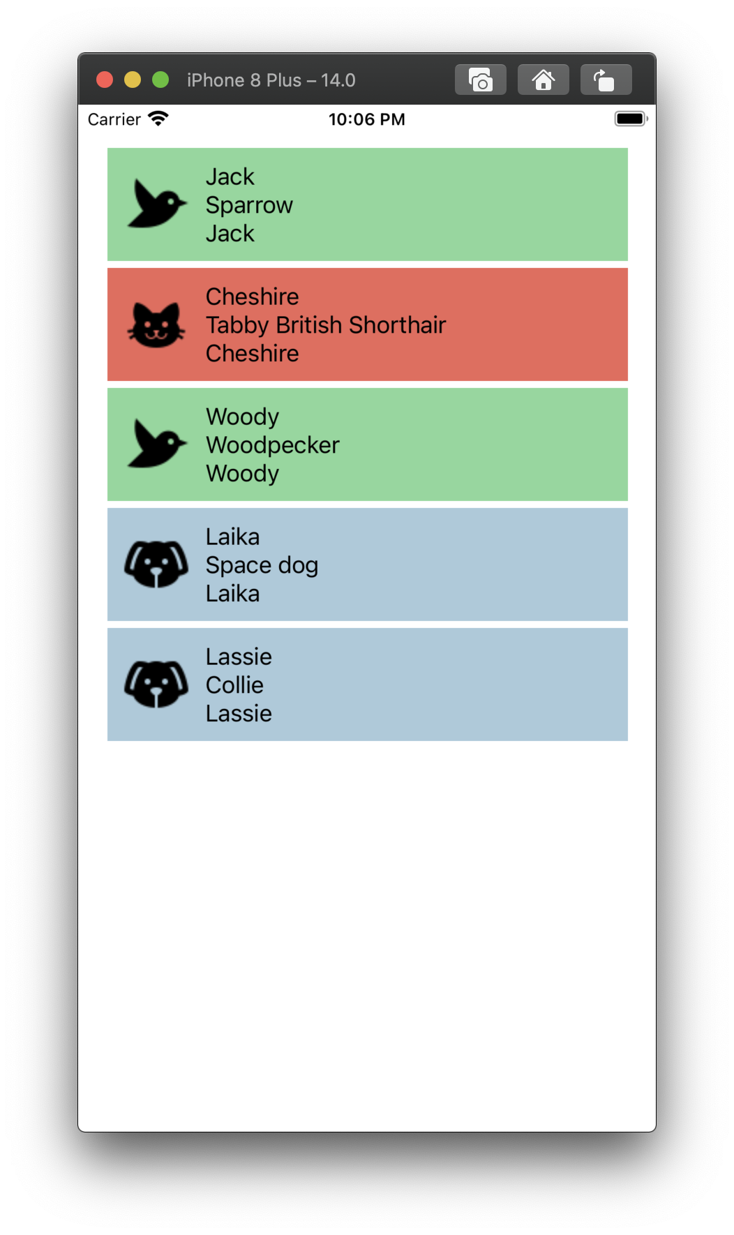
And with that, you’ll have following layout:
I know this was a longer post than usual, but it’s because several different components are in play here!
The potential they have is huge, so I would encourage you to try them out.
As always the actual example can be found on my GitHub here…